
 Pet Peeve Department.
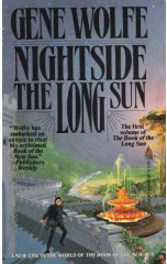
I’ve finally cleared away enough of my reading duties to get to Gene Wolfe’s Nightside the Long Sun (first of his four volume Long Sun series).
Okay…there’s something that bugs me about this cover right off the bat, and it takes me a while to figure out what it is. Not a surprise. Tor Books, in my opinion, does not design Wolfe’s books the way I think an author of his calibre deserves. (The reprint of Peace looks like a rip-off from Mad Magazine.) On the other hand, Gene Wolfe probably thinks they’re fine, so if he doesn’t complain, why the heck should I?
But in this case?
Ever seen Errol Flynn’s classic Sea Hawk? Great movie.
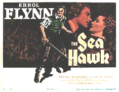 Great poster. I guess the artist for Nightside thought so, too, and was dumb enough to think no one would notice. (For all I know, this caused a minor storm back when the book was first issued.)
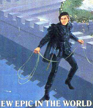 I mean, sheesh! Right down to the stance of Errol’s boots. Talk about ‘cut-and-paste.’
To be fair, this is from the 1993 hardcover and paperback…and since then, Tor has done better by Wolfe. They mercifully decided not to use this cover in the two volume omnibus edition.
But… can you imagine Penguin kissing off William Trevor with this kind of cut-rate junk cover design? Or Harper kissing off Neal Stephenson?
No, I didn’t think so.
I’ve seen this kind of thing before. Some other relatively recent science fiction paperback had a cut-and-paste job of Clint Eastwood ripped right off the poster of Kelly’s Heroes.
And science fiction readers still wonder why the genre isn’t taken seriously….